Edmonton’s Cityview Logo Redesign
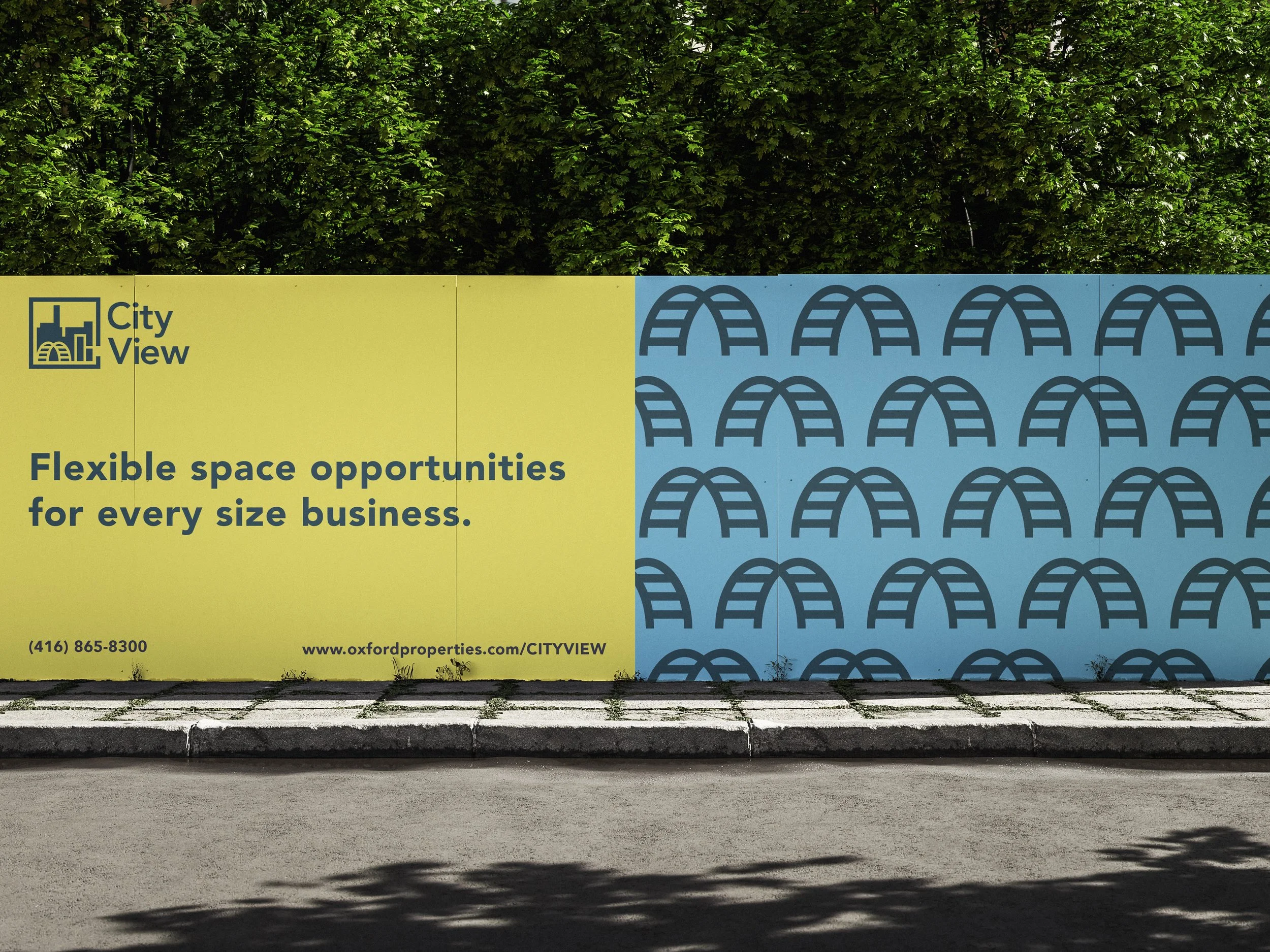
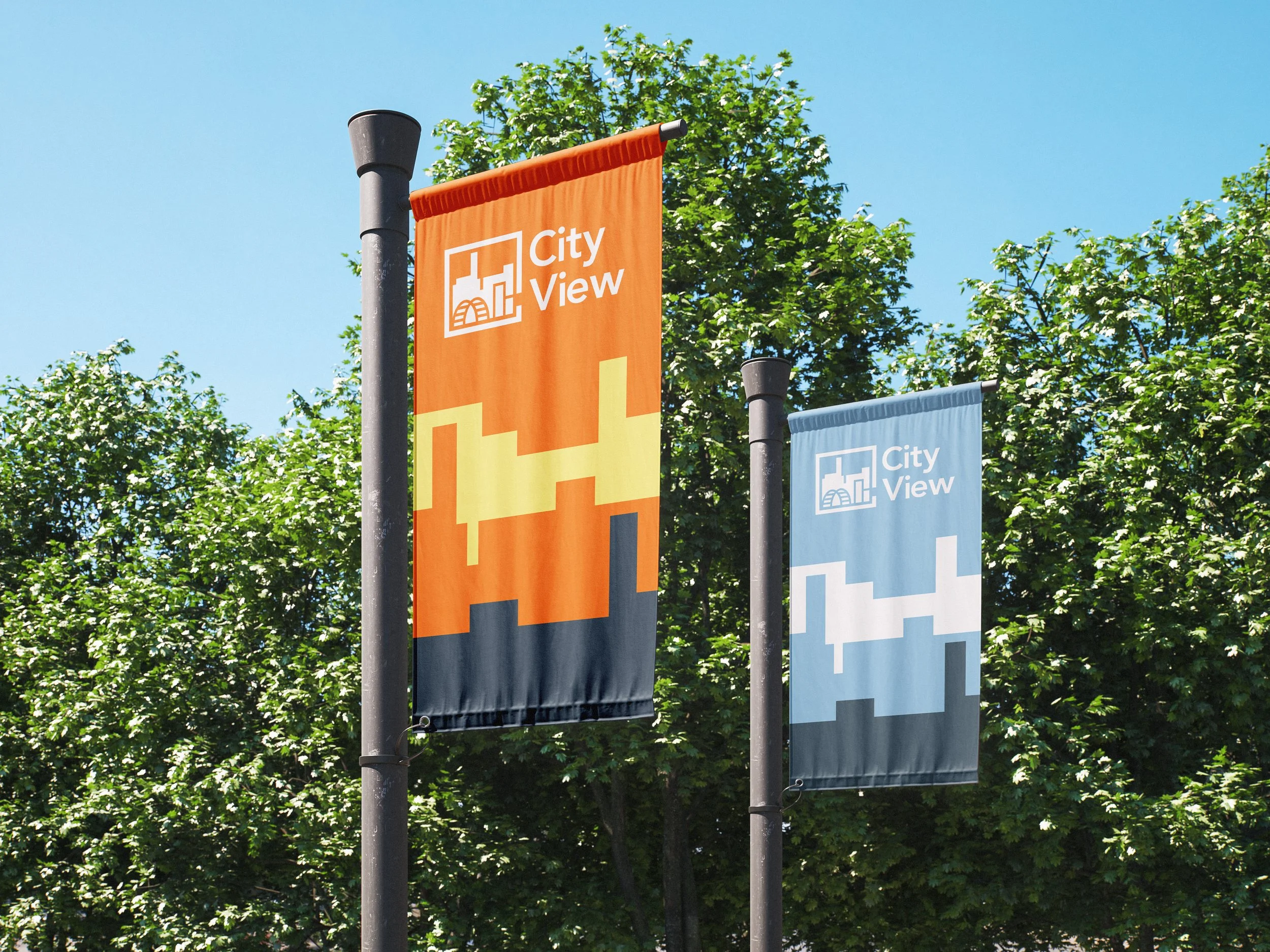
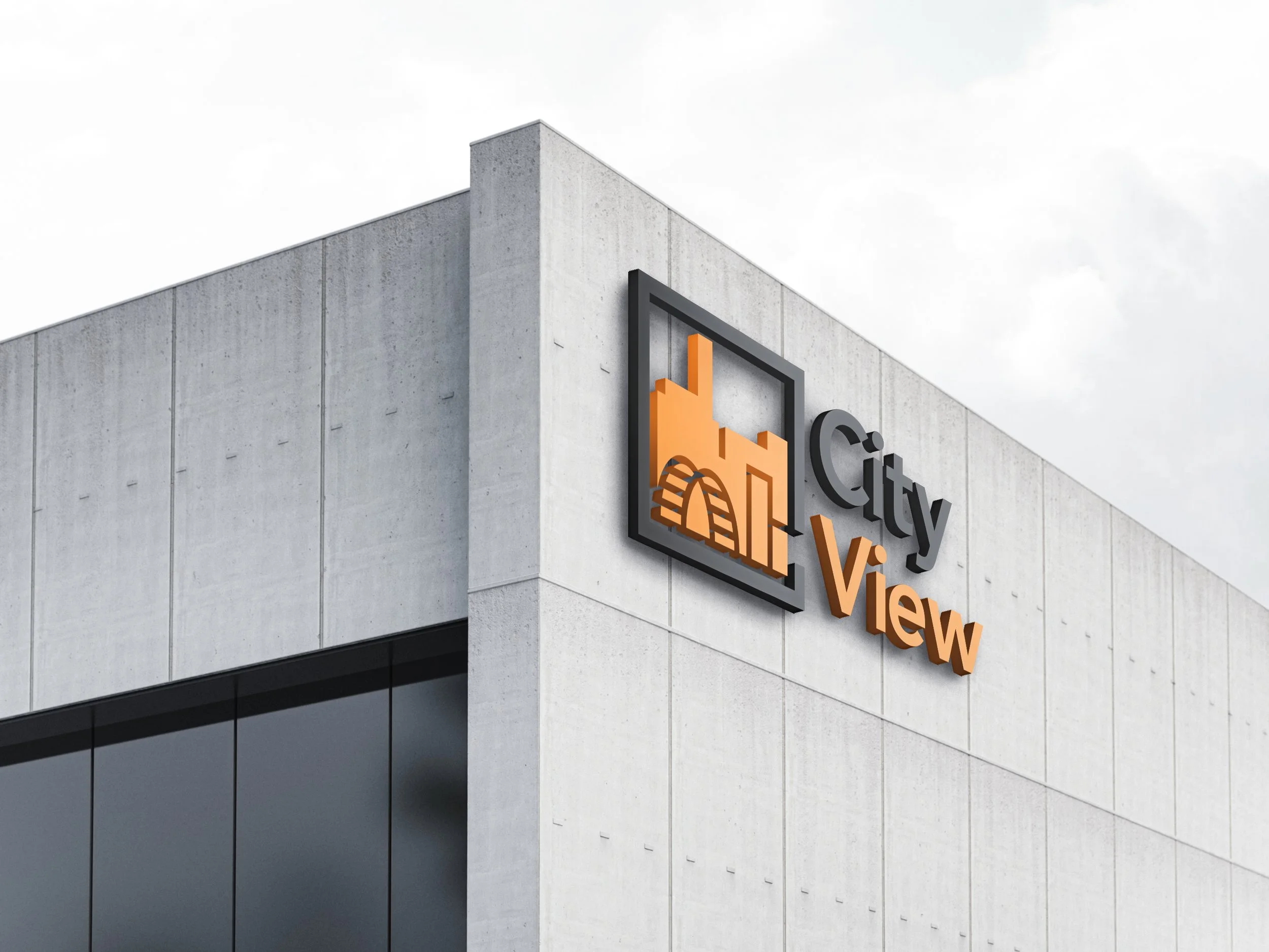
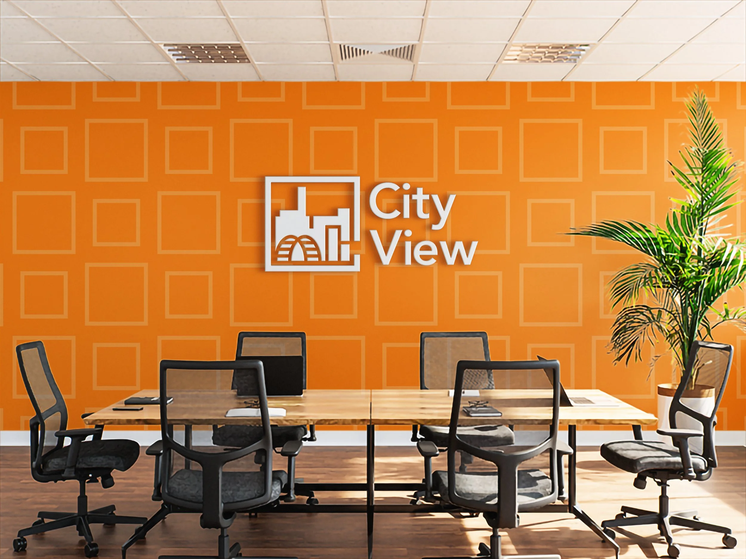
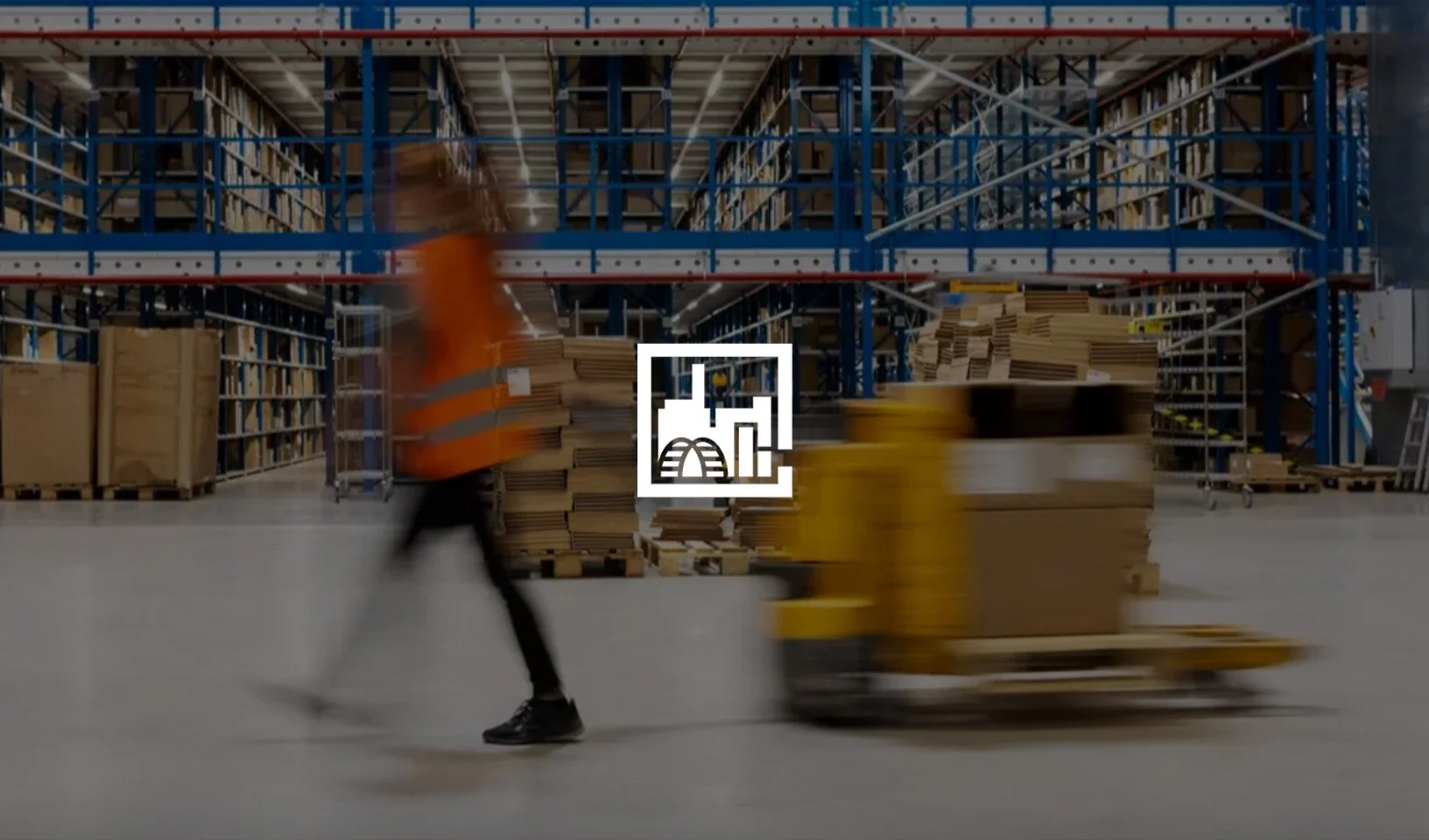
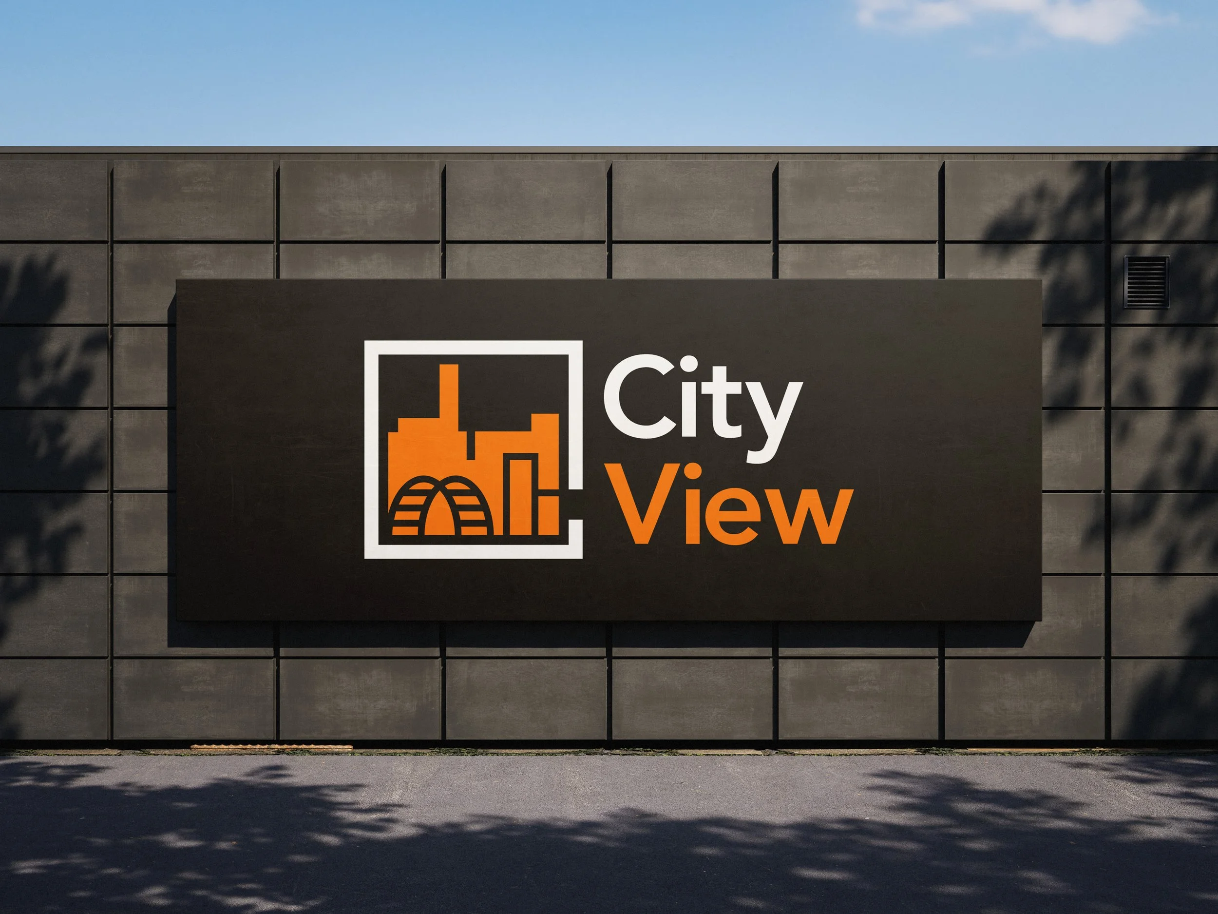
CityView is a redesigned logo that represents a window overlooking a modern and sleek landscape reflecting opportunity, and the orange silhouette reinforces the idea of a modern and efficient space for businesses.
Client
Course Project for DESN 311
Year
2025
Problem
Design a lettermark for a business park or community in Edmonton that visually communicates its core values.
Solution
The CityView lettermark reflects opportunity, flexibility, and innovation through a clean, geometric design. The “C” is constructed as a square window, symbolizing a “window of opportunity” and framing a modern cityscape inspired by Edmonton’s High Level Bridge.
A bold orange and black palette balances approachability with professionalism. Orange conveys creativity and confidence, while black reinforces sophistication. Paired with the Avenir typeface, the identity presents a modern, stable, and high-quality business environment.